30-08-2022
Healthcare Design and Colour Psychology Maninder Kaur
Role of Colours in Design
Colours play a crucial role in our daily lives. We perceive them with the help of our visual senses. Architecture, being related to visual imagery, has an explicit relationship with colours. Different kinds of spaces in the built environment employ pertinent colours dictated by a theme, the typology of space, the psyche of the end-users, cultural influences, and other factors.
For architects and designers, the function of colours goes far from being a device for decoration. Instead, colours set the personality and mood of the users, acting as a tool to interact with their sensory perception, hence manifesting as an active device of visual communication.
Colours in Healthcare Spaces - How it affects different user groups
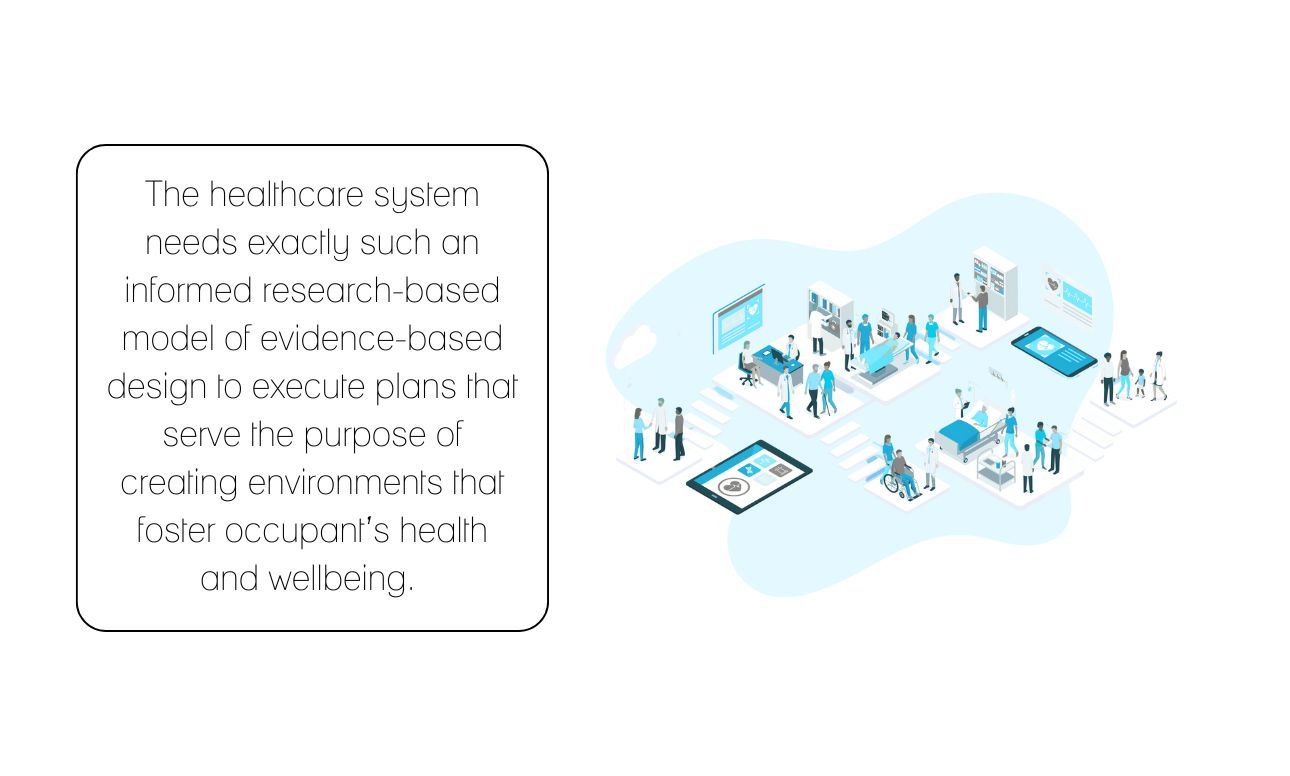
Healthcare spaces such as hospitals, clinics and wellness centres are sensitive spaces that cater to the ailing and sick. Patients’ caregivers also require a productive environment conducive to favourable conditions and a positive environment that facilitates emotional and mental well-being.

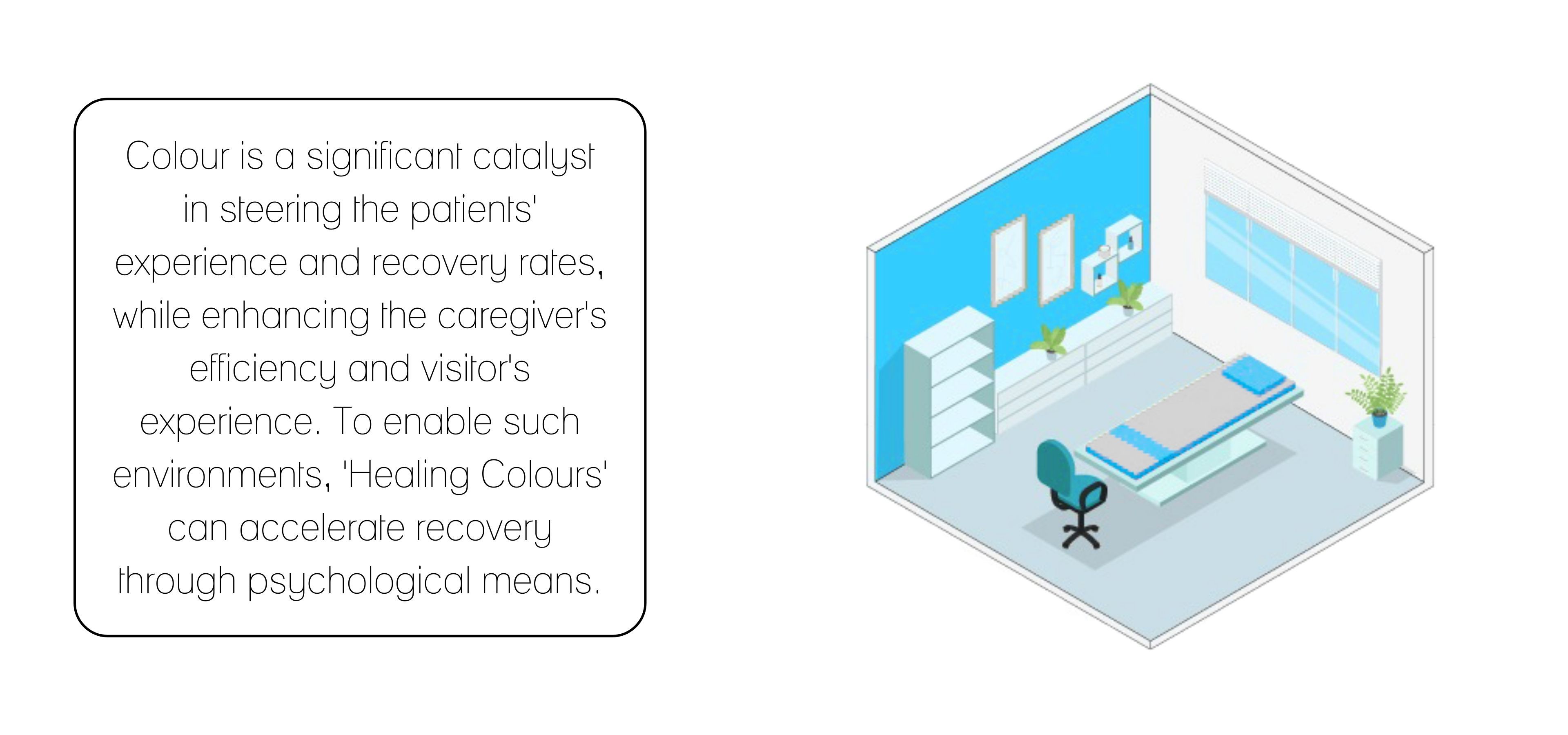
Colour is a significant catalyst in steering the patients' experience and recovery rates, while enhancing the caregiver's efficiency and visitor’s experience. To enable such environments, ‘Healing Colours’ can accelerate recovery through psychological means. As healthcare architects, we experimented with a colour palette that employs ‘Healing Colours’ or ‘Earth Colours’ in the project Max Super Speciality Hospital in Vaishali. In this palette, neutral and calming colours such as whites and light browns have been used to imbue a soothing effect on the residents and visitors. Similarly, in the Yashoda Super Speciality Hospital, Kaushambi, we picked whites, greys and light browns to radiate a healing effect.

Relevant Colours and Strategies for Different Spaces in a Hospital
The green colour symbolises health and well-being and is associated with optimism and hopefulness. Moreover, it also conveys the biophilic nature of human beings, which means staying closer to nature. When used in healthcare design, this colour can elevate the patient and the visitor's experience. Putting the concept to use, the entrance lobby of the Aakash Super Speciality Hospital project in New Delhi is rendered with touches of biophilic green alongside light wood and whites.

During the healing process, a patient is required to move to different spaces within the hospital building. These spaces, along with the transitions, can be designed to reduce stress and fear-induced intimidation exercised by dull, dim-lit and tight-knit areas. Additionally, patients are in a supine position with their sight on the ceilings, most of the time. Therefore, the ceilings need to be designed and rendered in calming tones to relax patients.
Paediatric hospitals and clinics work for the betterment of children’s health. Since children are more inclined toward colourful spaces, a paediatric healthcare space should attain a balance between the tones that are colourful and calming. For example, a combination of vibrant orange and calming blue achieves the equilibrium of vivid and soothing interiors. Such a palette projects a playful vibe breaking away from an intimidating clinical environment.

Healthcare spaces need not create an impression of mundane treatment facilities; instead, they can be healing spaces with an ambience that craft a benign environment. It goes on to show that colour is one of the driving factors that aid in the betterment of healthcare design. With this knowledge in place, healthcare design practitioners can create colour palettes that pave the way for better healing spaces in the built environment.